

ORIGINAL WORKS & EDITIONS
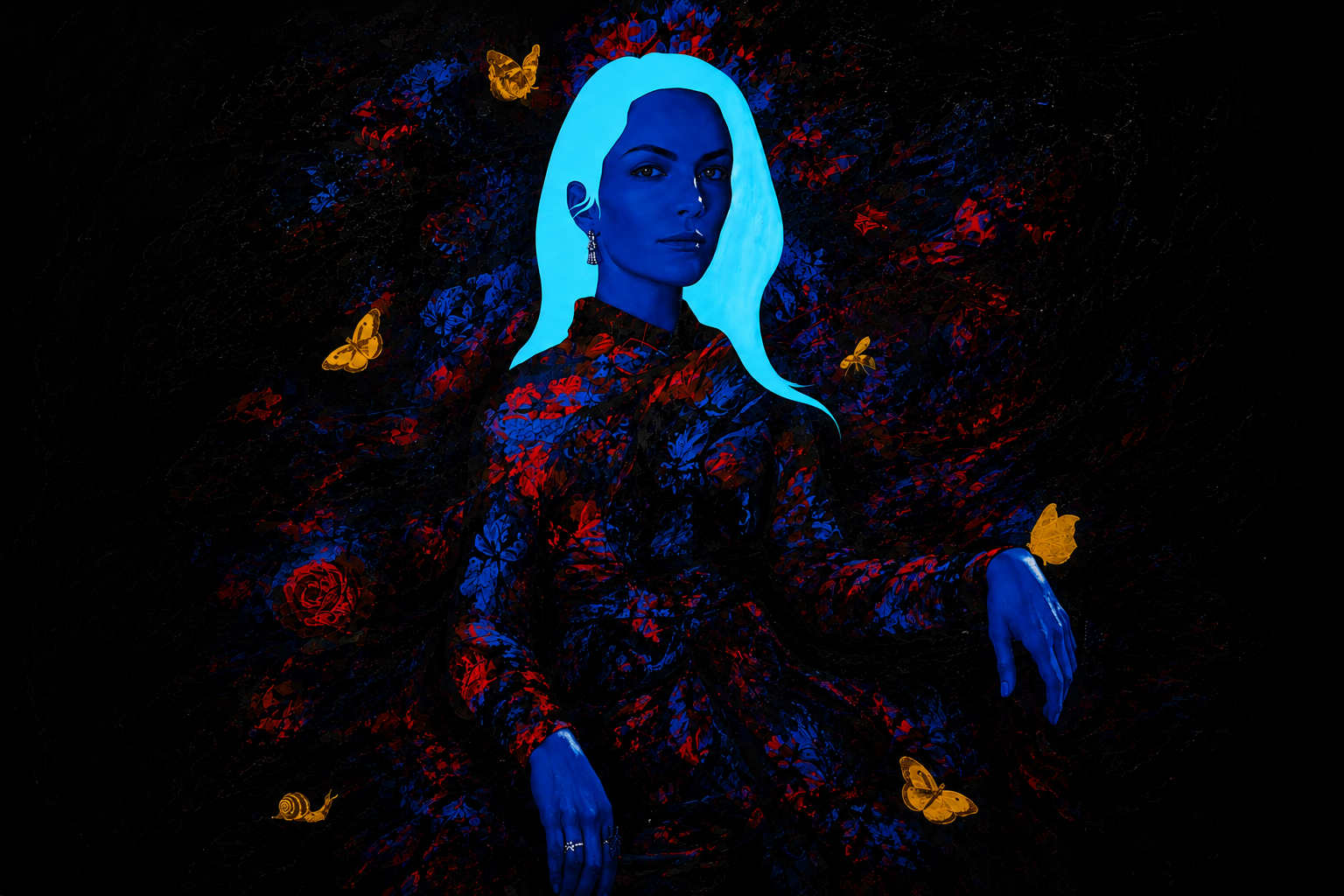
Beautiful, unsettling and meticulously composed, Magnus Gjoen’s work blends classical imagery, luxury, mortality and destruction.
His pieces often turn familiar symbols into something unexpectedly elegant, and sometimes quietly threatening.
MAGNUS GJOEN
BEAUTY IN DARKNESS
❋
LOVE & DESTRUCTION
❋
CLASSICAL FORMS. MODERN STORIES.
❋
MEMENTO MORI
❋
BEAUTY IS NEVER QUITE WHAT IT SEEMS
❋
MAGNUS GJOEN
❋
BEAUTY IN DARKNESS ❋ LOVE & DESTRUCTION ❋ CLASSICAL FORMS. MODERN STORIES. ❋ MEMENTO MORI ❋ BEAUTY IS NEVER QUITE WHAT IT SEEMS ❋ MAGNUS GJOEN ❋
WORKS IN THE COLLECTION
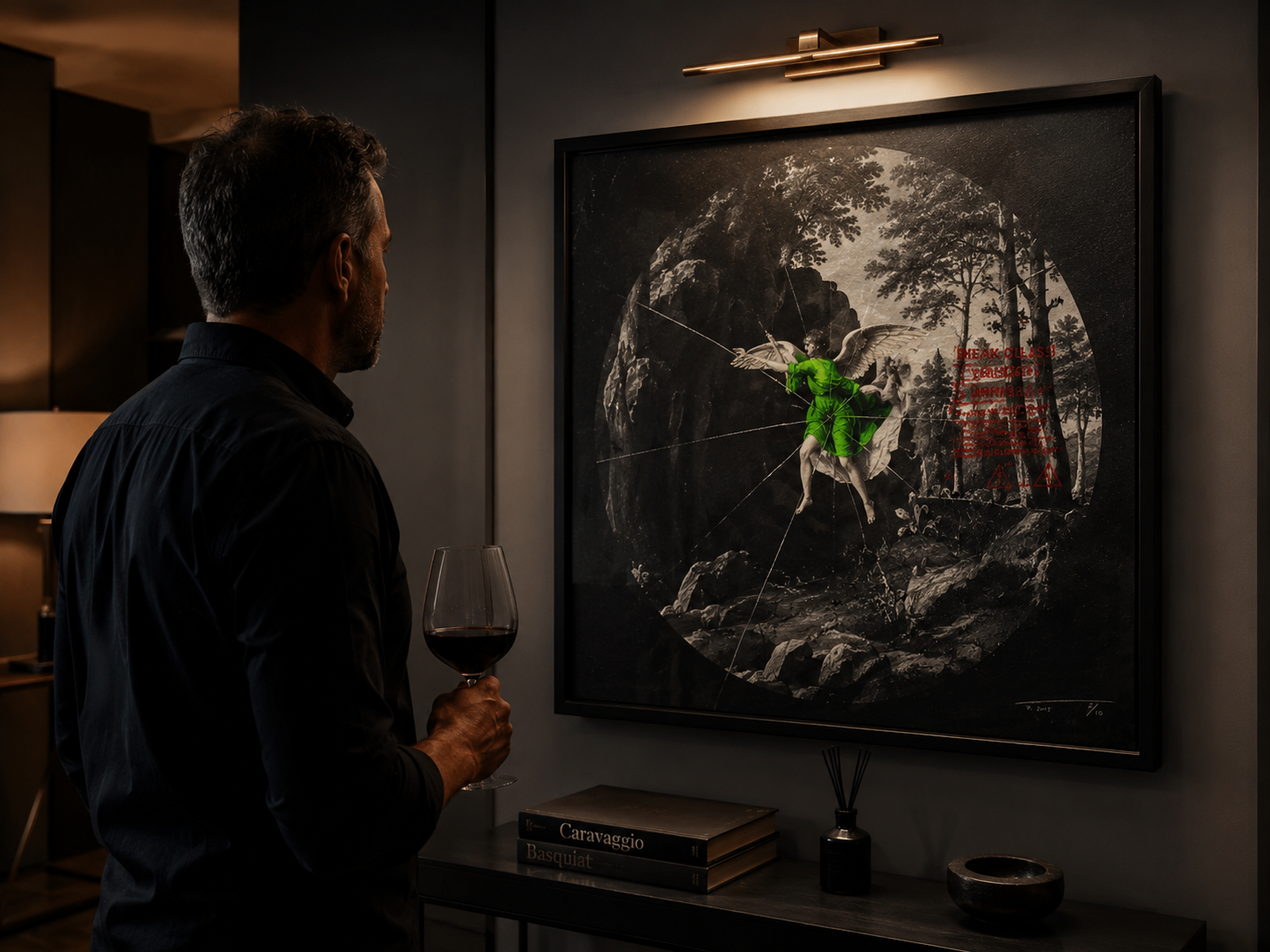
ESCAPE FROM EDEN
Magnus Gjoen
2019
Edition 18 of 80
70 × 70 cm
Archival pigment inks on 310gsm German etching paper
Signed and numbered by the artist
This was one of the first pieces I purchased directly from Magnus himself.
What initially drew me to the work was the extraordinary contrast within the image. Against the darkness of the surrounding landscape, the vivid green angel immediately commands your attention. I found it completely captivating.
But, as with so much of Magnus's work, there is far more to the piece than you first see. The classical imagery, the fractured glass and the contemporary warning graphics create this wonderful tension between beauty and destruction, fragility and danger.
Learning more about the story and thinking behind the work only strengthened my connection to it, and I made the decision to acquire the piece directly from Magnus for my collection.
Escape From Eden remains particularly special to me, not only because of the work itself, but because it represents one of the earliest pieces in my Magnus Gjoen collection.
From The Allun Lewis Collection
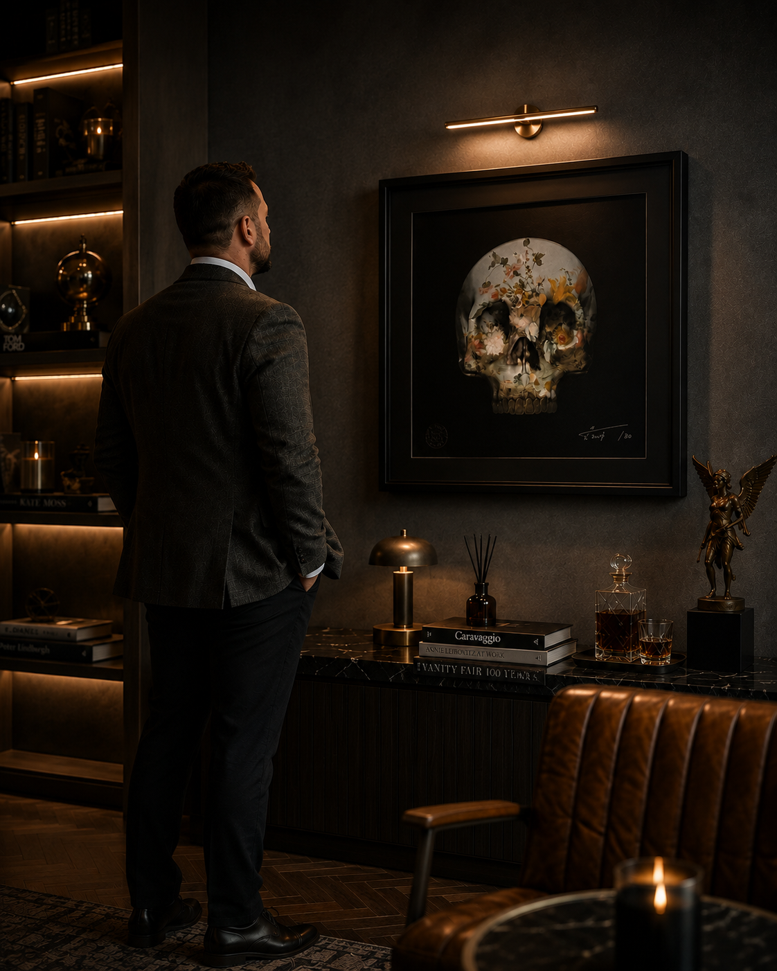
Archival pigment inks on 308gsm cotton rag
50 × 50 cm
Edition 1 of 80
Signed and numbered by the artist
From The Allun Lewis Collection
THE STORY BEHIND THE PIECE
Sometimes the story of acquiring a piece becomes almost as important as the artwork itself.
This piece completed a trilogy for us.
We already owned the first two works in the series, but by the time I went looking for the third, it had sold out. I searched for another without success and eventually decided there was only one thing left to do — phone the number on Magnus's website and ask.
I wasn't expecting Magnus himself to answer.
That conversation became my first ever interaction with him.
I explained that we already owned the other two pieces and that I was trying to complete the trilogy. Rather remarkably, Magnus told me that he'd recently returned from Florence and that he did, in fact, have one remaining. A previous purchase hadn't completed, meaning this supposedly sold-out work had unexpectedly become available again.
I didn't need asking twice.
I snapped it up.
Not only had I managed to complete the trilogy, but the piece that arrived was Edition 1 of 80 — something that has made it feel even more special ever since.
The artwork itself is also one I've always found incredibly reflective.
At its centre is perhaps one of the most universal images there is: the human skull.
Strip away status, possessions, success, failure and all the labels we accumulate throughout our lives and, ultimately, we all end up the same.
But Magnus doesn't leave the skull untouched.
Across it are flowers, colour, beauty, darkness and imperfections. And that's where I find the meaning in the piece.
Because perhaps what ultimately distinguishes one life from another isn't the destination. It's everything that happens on the journey towards it.
The people we love.
The experiences we collect.
The mistakes we make.
The scars we carry.
And the marks we leave behind.
We may ultimately share the same destination.
But the story we leave behind is entirely our own.
And there's something wonderfully fitting about this particular piece.
It was the final artwork I needed to complete a trilogy.
It was Edition 1 of 80.
And it became the first chapter in my relationship with Magnus Gjoen.
From The Allun Lewis Collection
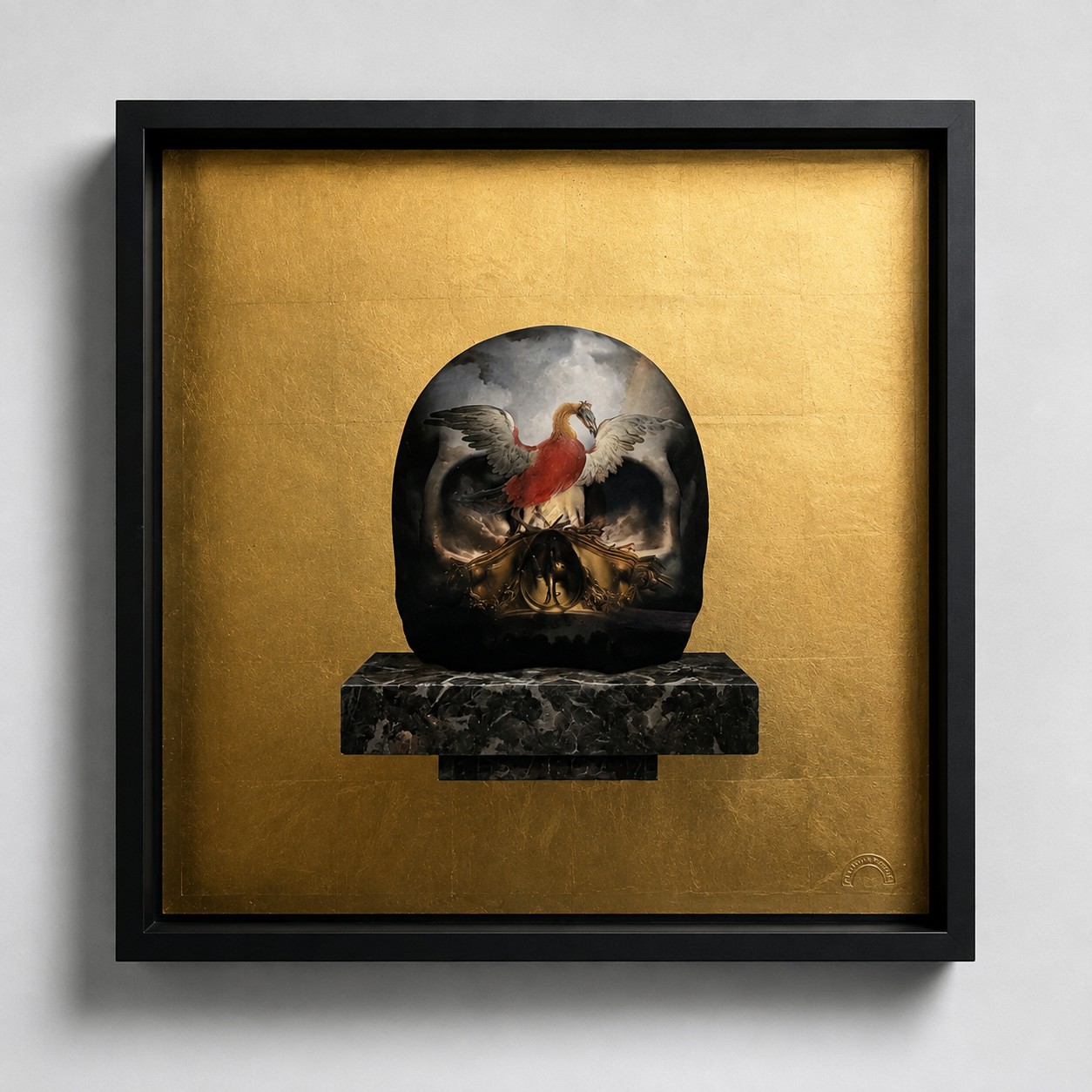
Magnus Gjoen
2022
Edition 3 of 50
50 × 50 cm
Archival pigment inks and 24ct gold leaf on 308gsm cotton rag
Signed and numbered by the artist
Some pieces enter a collection because you love the artwork. Others become part of your story.
I bought this piece because of Maria.
For as long as I can remember, one of Maria's symbols has been the phoenix. She once told me why: for her, it represented where she had come from — the idea of rising from the ashes, rebuilding and emerging stronger from everything that had gone before.
So when we came across No Longer Fear The Darkness, the connection felt immediate.
The detail in the piece is quite simply superb. The gold leaf is extraordinary in person, changing with the light, while at its centre sits this beautiful yet powerful image of the phoenix emerging from the darkness.
And that's what I see when I look at it.
The darkness is still there. But it no longer has the power. The phoenix has risen above it.
There was something else that made this particular acquisition special. We bought the work directly from Magnus himself, and we have a photograph from that day of Maria standing alongside him.
That photograph has subsequently become part of the story of the artwork for me. It captures the moment when something that had represented part of Maria's story became something physical that we could take home and live with.
I didn't buy this simply because it was a Magnus Gjoen.
I bought it because when I looked at it, I saw Maria.
And that makes it one of the most personal pieces in the collection.
From The Allun Lewis Collection
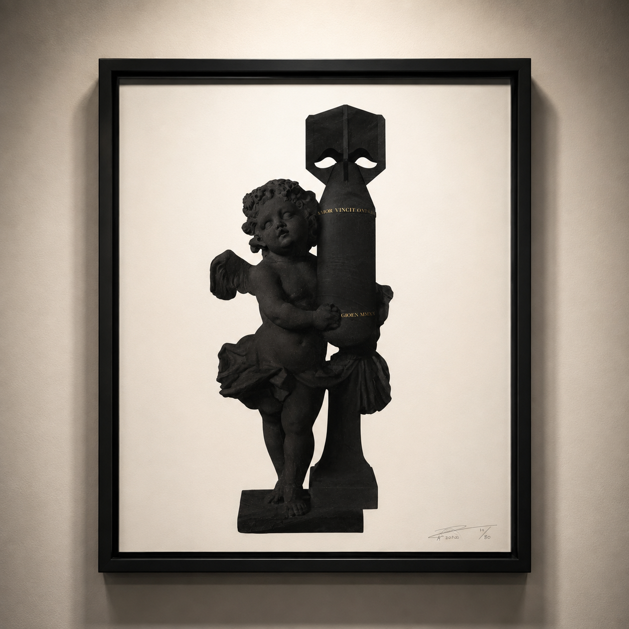
Magnus Gjoen
2020
Archival pigment inks on 308gsm cotton rag
50 × 72.5 cm
Limited edition number 14/25
Signed and numbered by the artist
From The Allun Lewis Collection
THE STORY BEHIND THE PIECE
Sometimes it isn't simply the artwork that draws you in. Sometimes it's a few words.
We discovered this piece while visiting an art festival at St Pancras, where we once again had the pleasure of meeting Magnus in person.
On this occasion, we didn't leave with just one.
We purchased all four different colourways of Cupid, each presenting the same extraordinary image in a slightly different way.
But strangely, it wasn't the colour, the scale or even Cupid himself that ultimately sold the work to me.
It was the words running through it:
AMOR VINCIT OMNIA
Love Conquers All.
Being someone who has always been drawn to classical history, imagery and symbolism, there was something about seeing those words incorporated into a contemporary artwork that immediately struck home with me.
The phrase has survived for more than two thousand years, originating in the writings of the Roman poet Virgil, yet its message remains remarkably simple and just as relevant today.
Love conquers all.
And, in truth, I believe it does.
Life can throw an extraordinary amount at us. Relationships are tested. Circumstances change. People experience success, failure, loss and everything in between.
Yet genuine love has an extraordinary ability to endure.
That's what transformed this from an artwork I admired into something I wanted hanging on our wall.
I also love the contradiction Magnus creates.
Cupid is one of the great classical symbols of love, yet here that familiar innocence is juxtaposed with imagery that feels powerful, imposing and almost threatening.
Perhaps that's appropriate.
Because love isn't necessarily weak or delicate.
Love can be one of the most powerful forces we experience.
And perhaps that's why Amor Vincit Omnia has survived for more than two millennia.
The world around those words has changed almost beyond recognition.
Their meaning hasn't.
For me, these four works aren't simply four different versions of the same image. Together they remind me of a very simple philosophy that I hope never changes:
Whatever else life places in our way, love has the power to overcome it.
Amor Vincit Omnia.
Love Conquers All.
From The Allun Lewis Collection
Featured CollectionTHE PIECE THAT SHOULDN'T EXIST.
PROOF OF LOVE · 2019
A unique production / printer's proof 1/1, created on aluminium and never intended to become an artwork in its own right.
Seven years after it was created, Magnus confirmed its extraordinary story — and finally gave the unnamed work a title.
Proof of Love.
One piece. One extraordinary accident. One story that could never be repeated.
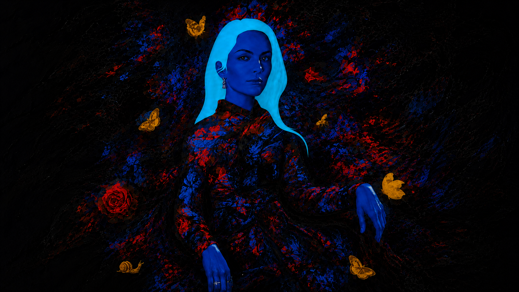
Production / Printer's Proof 1/1
Unique work on aluminium
Signed by the artist
2019
From The Allun Lewis Collection
THE PIECE THAT SHOULDN'T EXIST
Every collection has pieces with stories. This one has a story that probably shouldn't have been possible.
Maria and I had been invited to a private showing at Enter Gallery's Brighton studio with Lawrence.
There were plenty of interesting works around us, but while we were looking through the studio, Maria spotted something tucked away in a corner.
It immediately stopped us.
Neither of us knew exactly what it was at first. We simply thought it was brilliant.
Then we looked closer.
It was a Magnus Gjoen.
And not just a Magnus we hadn't seen before — this was something altogether more unusual.
After a little negotiating and bartering with Lawrence, we managed to secure it. What followed was perhaps the least sophisticated part of the acquisition: trying to work out how on earth we were going to get this enormous piece into the car.
Somehow, we did.
At the time, however, we didn't fully understand what we'd actually bought.
That came later.
THE MYSTERY
Years after acquiring it, I contacted Magnus directly because I wanted to establish exactly what we had.
His response transformed the story of the piece.
Magnus described it to us as:
“The piece that shouldn't exist and that you shouldn't have.”
The work had originally been produced as part of the process for another artwork commissioned for Laura.
When it reached the framers, marks and imperfections were discovered and another version was produced. The assumption was that this earlier aluminium version would be collected, stripped back and reused.
Except that never happened.
The replacement went on to become the finished work.
This one survived.
Somehow, the piece that was never intended to enter the world as an artwork in its own right remained in existence — eventually finding its way into a corner of a Brighton gallery, where Maria happened to notice it.
And ultimately, onto our wall.
WHAT EXACTLY IS IT?
I subsequently asked Magnus the question I really wanted answered: given the extraordinary circumstances surrounding it, how should the work actually be described?
His answer was wonderfully clear.
Production proof / printer's proof 1/1.
There isn't an edition of them.
There isn't another numbered example sitting somewhere waiting to appear.
This is the production proof that survived when it wasn't supposed to.
One piece. 1/1.
And that makes its imperfections part of the story rather than something I would ever want to remove.
SEVEN YEARS WITHOUT A NAME
There was one final part of the mystery.
The woman depicted in the work never actually had a name.
For seven years she had existed — somewhat accidentally — without one.
So I asked Magnus whether, after all this time, perhaps she deserved to be named.
He gave me two choices.
The Lost Reserve — a reference to rum.
Or:
PROOF OF LOVE
The moment he explained it, there was really only one choice.
“Proof” refers to the artwork itself — the surviving production proof.
But it also refers to alcohol proof, connecting back to Laura, the woman for whom the original project was created, and her association with rum.
I loved it.
Proof of Love.
A title given by Magnus himself, seven years after the work was created, to a piece that was never supposed to survive in the first place.
WHY IT MATTERS TO ME
There is something wonderfully improbable about the whole story.
An imperfect production version was supposed to disappear.
It didn't.
Years later, Maria spotted it sitting almost anonymously in the corner of a gallery.
We didn't know its history.
We didn't know it was a 1/1.
We didn't even know that technically it shouldn't exist.
We just loved it.
And perhaps that's the part of the story I like most.
Because everything we've discovered since — its history, its uniqueness, Magnus confirming its status and ultimately giving it a name — came afterwards.
The reason it entered our collection was much simpler.
Maria saw something in the corner of a room that made us both stop and look.
And really, that's exactly why I collect art in the first place.
PROOF OF LOVE
Magnus Gjoen · 2019
Production / Printer's Proof 1/1
Unique work on aluminium
Title subsequently given by the artist
The piece that shouldn't exist.
The artwork we shouldn't have.
And now, Proof of Love.
From The Allun Lewis Collection
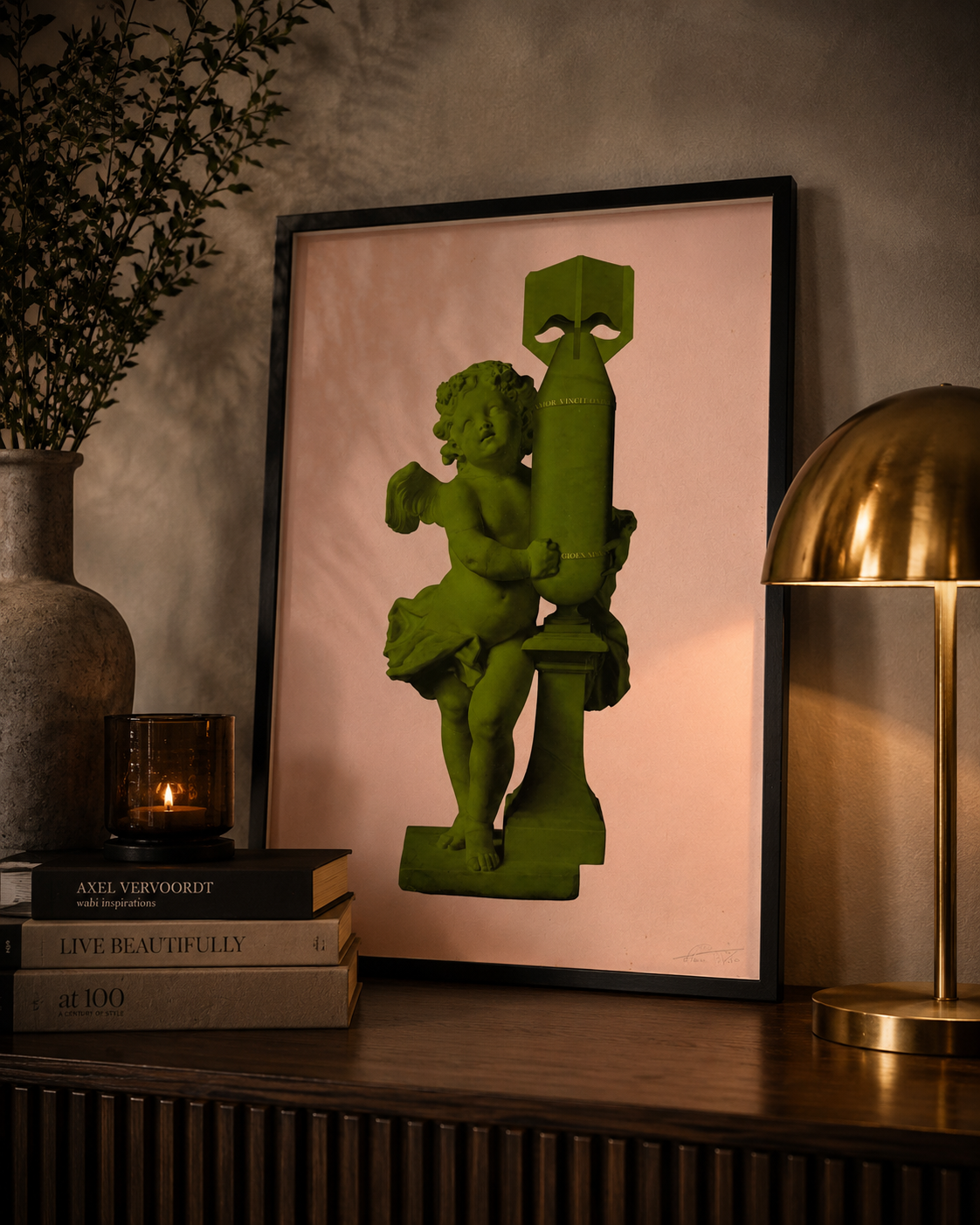
Magnus Gjoen
2020
Limited Edition of 50
50 × 72.5 cm
Archival pigment inks on 308gsm cotton rag
Signed and numbered by the artist
From The Allun Lewis Collection
THE STORY BEHIND THE PIECE
Amor Vincit Omnia.
Love Conquers All.
There are certain words and phrases that seem capable of surviving almost anything.
Languages change. Empires disappear. Generations come and go.
Yet more than two thousand years after the Roman poet Virgil wrote the words from which this familiar phrase developed, the idea remains remarkably powerful.
Love conquers all.
And perhaps that's why this particular Magnus Gjoen image resonated with me so strongly.
CUPID AND THE BOMB
At first glance, there is something almost beautiful about the composition.
Cupid — one of the most recognisable symbols of love in Western art — embraces the object beside him.
But it isn't another classical figure.
It isn't a bow and arrow.
It's a bomb.
Magnus describes the work simply as a modern take on Cupid and his bow and arrow.
And that transformation changes everything.
Something traditionally associated with love and desire is placed alongside something created for destruction.
Innocence and violence.
Love and war.
Beauty and brutality.
Two completely opposing ideas occupying the same image.
AMOR VINCIT OMNIA
Running across the bomb are the words:
AMOR VINCIT OMNIA
Love Conquers All.
For me, those words are what transform the piece.
Without them, you could interpret the image simply as another of Magnus's wonderful collisions between classical beauty and modern destruction.
But the words introduce something else.
Perhaps Cupid isn't frightened of the weapon.
Perhaps he's embracing it.
Perhaps love is capable of neutralising something created to destroy.
Or perhaps the contradiction is deliberately impossible.
That's the beauty of it.
Magnus gives us the image. We decide what it means.
LOVE CONQUERS ALL
This piece also has a natural connection to the four Cupid colourways already within my collection.
When Maria and I discovered those works at an art festival at St Pancras, it was those same Latin words that ultimately sold them to me.
I've always been fascinated by history, classical imagery and symbolism, and there is something extraordinary about seeing an ancient idea carried forward into contemporary art.
The world in which those words were first written is almost unimaginable to us today.
And yet the emotion behind them hasn't changed.
We still love.
We still lose.
We still fight.
We still hope.
And we still want to believe that, ultimately, love is stronger than everything placed in its way.
AN EDITION OF 50
This version of Cupid (Amor Vincit Omnia) was created in 2020 as an edition of 50.
Measuring 50 × 72.5 cm, it was produced using archival pigment inks on 308gsm cotton rag.
Its larger scale gives the image a very different presence from some of the smaller Magnus works within my collection.
Cupid doesn't disappear into the composition.
Neither does the bomb.
You're forced to confront both.
And then you notice those words.
Amor Vincit Omnia.
WHY IT BELONGS IN MY COLLECTION
Looking across my Magnus collection, I increasingly realise that many of the pieces are connected by contradictions.
Beauty and destruction.
Life and mortality.
History and contemporary culture.
Love and vulnerability.
This one may express that tension more simply than almost any other.
A classical symbol of love.
A modern symbol of destruction.
And four words written between them:
Amor Vincit Omnia.
I don't know whether love genuinely conquers everything.
Life is probably far too complicated for that.
But I know which side of the argument I'd rather believe in.
And perhaps that's why these words have survived for more than two thousand years.
Love Conquers All.
From The Allun Lewis Collection
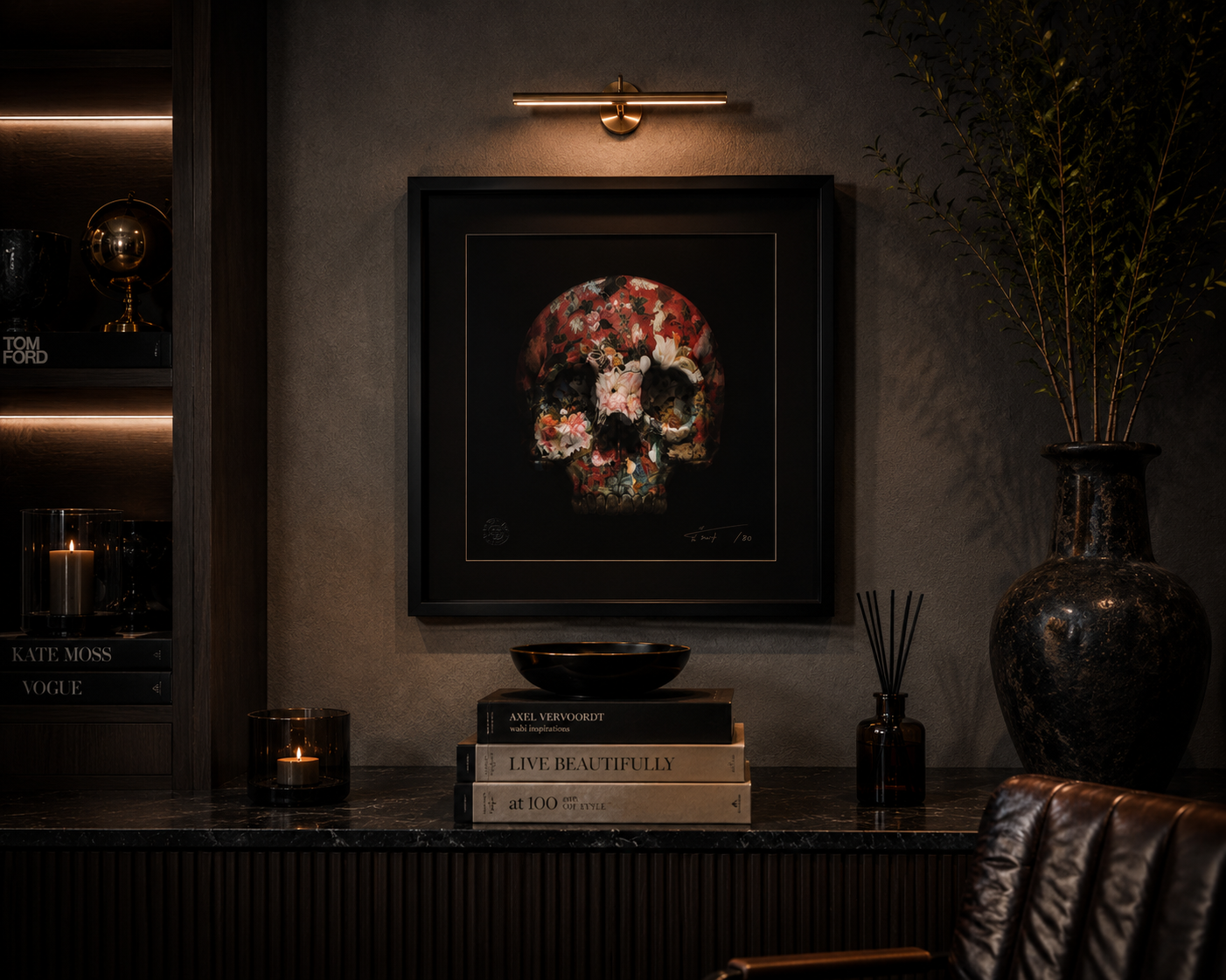
Magnus Gjoen
2019
Limited Edition of 80
50 × 50 cm
Archival pigment inks and silk-screen varnish on 308gsm cotton rag
Signed and numbered by the artist
From The Allun Lewis Collection
THE STORY BEHIND THE PIECE
There are some artworks where the title changes the way you see the image.
For me, this is one of them.
There Is Strong Shadow Where There Is Much Light.
Before you even begin looking at the artwork itself, those words create a tension.
Light and darkness.
Beauty and mortality.
Life and death.
And then you see the skull.
BEAUTY IN THE DARKNESS
At first glance, the imagery couldn't be more familiar.
A human skull.
One of the oldest symbols of mortality in art.
But Magnus doesn't present it as something cold or frightening.
Instead, the skull is consumed by flowers.
Rich reds, delicate whites, flashes of blue and green appear from the darkness, transforming something we instinctively associate with death into something unexpectedly beautiful.
It's a modern interpretation of the memento mori tradition — art that reminds us that life is temporary. Enter Gallery similarly describes the work as celebrating the fragility of being alive through blossoming flowers.
And I think that's what makes the piece so effective.
The flowers don't remove the darkness.
They exist within it.
THERE IS STRONG SHADOW WHERE THERE IS MUCH LIGHT
The title comes from a line attributed to Johann Wolfgang von Goethe:
“There is strong shadow where there is much light.”
I love that idea.
Because the two aren't necessarily opposites.
Perhaps one exists because of the other.
We recognise happiness because we've experienced sadness.
We appreciate success because we've experienced failure.
We understand how precious moments can be because somewhere in the background sits the knowledge that none of them last forever.
And perhaps that's what the skull represents.
Not death in a sinister sense.
Perspective.
LOOK CLOSER
From a distance, you see a skull.
Move closer and something else begins to happen.
The mortality almost disappears.
You start noticing the individual flowers, colours, textures and tiny details woven throughout the image.
And suddenly you're looking at life rather than death.
I think that's very clever.
Because depending on where you stand — both literally and metaphorically — you can see something completely different.
From one perspective, death surrounds the flowers.
From another, life has completely consumed death.
WHY IT BELONGS IN MY COLLECTION
This piece probably represents my attraction to Magnus's work as well as almost anything I own.
It isn't simply beautiful.
There is a contradiction sitting underneath the beauty.
Magnus repeatedly explores that territory — taking imagery associated with mortality, conflict or destruction and presenting it in ways that challenge our preconceived ideas about what we're looking at.
That's exactly the type of artwork I find myself returning to.
I don't particularly want a piece to tell me what to think.
I want it to make me think.
And this one does.
The skull reminds me that our time is finite.
The flowers remind me what we can do with it.
And the title perhaps reminds me that a meaningful life isn't one lived entirely in the light.
Sometimes it's the shadows that allow us to recognise just how bright the light really is.
LIFE THROUGH ANOTHER PERSON'S LENS
That's ultimately why this work belongs within my collection.
Magnus gives us his interpretation of beauty, mortality and the fragile relationship between the two.
I can understand his perspective without having to surrender my own.
And every time somebody else stands in front of it, they'll inevitably bring something different to it again.
Which brings me back to the idea at the heart of my collection:
The freedom to see through somebody else's eyes without surrendering our own.
There will always be shadows.
Perhaps the important thing is recognising the light.
From The Allun Lewis Collection
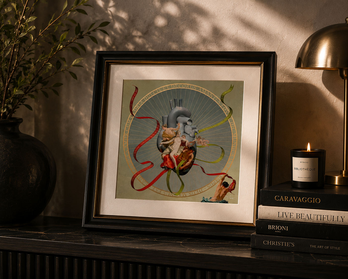
Magnus Gjoen
2021
Limited Edition 41 of 100
Giclée print
30 × 30 cm
Signed and numbered by the artist
From The Allun Lewis Collection
THE STORY BEHIND THE PIECE
I hate and I love.
Four words that seem completely contradictory.
And yet, perhaps that's precisely why they have survived for more than two thousand years.
At the centre of Odi Et Amo sits the human heart — not the romantic symbol we're accustomed to seeing, but the anatomical reality of it. Wrapped around it are classical figures, lovers and ribbons carrying words drawn from Roman love poetry.
It's unmistakably Magnus.
Something beautiful at first glance, but considerably more complicated the longer you look.
The title comes from one of antiquity's most famous explorations of conflicting emotion. The Roman poet Catullus wrote of experiencing love and hate simultaneously — unable to explain why, only knowing the torment of feeling both. The work also incorporates other classical expressions of love, surrender and desire.
And that's what I find fascinating about this piece.
Because love isn't always the beautifully packaged emotion we'd perhaps like it to be.
It can be irrational.
It can be contradictory.
It can make us incredibly happy and, sometimes, incredibly vulnerable.
Perhaps that's why Magnus chose a real human heart.
Not the perfect ❤️ we've turned into a universal symbol of love, but the complicated, imperfect organ that actually keeps us alive.
Around it is beauty, desire, mythology and romance.
But at the centre is something real.
41 OF 100
My copy is number 41 from the edition of 100.
Normally, the edition number isn't what determines my relationship with a work. But I love recording these details because every numbered piece has its own individual place within an edition.
This one is 41/100.
Signed by Magnus and dated 2021, it has become another chapter within a collection that increasingly reflects what draws me to his work in the first place: the collision between classical beauty and contemporary thought.
And perhaps the message at the heart of this particular work is actually quite simple.
Love doesn't have to be perfect to be real.
Sometimes it can be beautiful and difficult, rational and irrational, joyful and painful — all at the same time.
Odi et amo.
I hate and I love.
From The Allun Lewis Collection
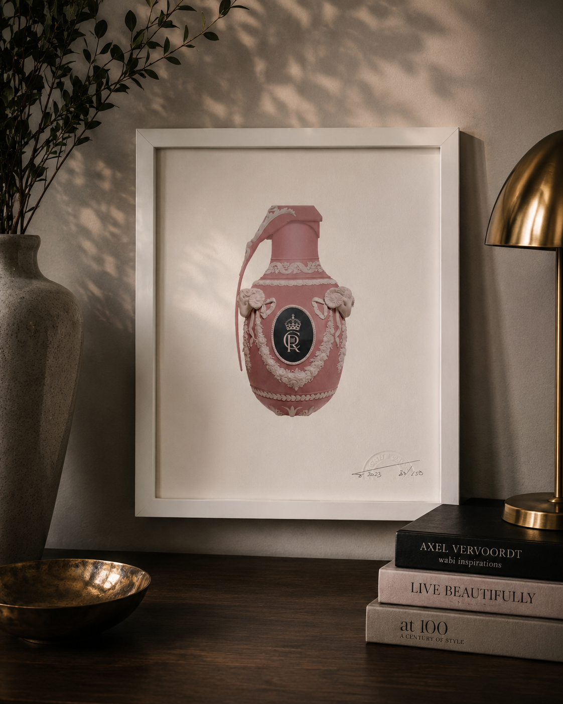
Magnus Gjoen
2023
Edition 89 of 100
20 × 20 cm
Archival pigment inks on cotton rag
Signed, dated and numbered by the artist
From The Allun Lewis Collection
THE STORY BEHIND THE PIECE
Long live the King.
Three words traditionally associated with ceremony, continuity and the transfer of power.
But, as is so often the case with Magnus, the image accompanying them isn't quite what you'd expect.
At the centre of Vive Le Roi is something immediately contradictory.
It looks delicate.
Decorative.
Almost precious.
A soft pink vessel covered in elaborate classical ornamentation, complete with garlands, ram's heads and royal insignia.
And yet its silhouette is unmistakable.
It's a grenade.
That contradiction is exactly what drew me to it.
BEAUTY AND DESTRUCTION
Magnus has an extraordinary ability to take an object associated with violence and make it beautiful.
Here, something designed to destroy has been transformed into something that wouldn't look entirely out of place among the porcelain and decorative objects of a stately home.
The softness of the pink makes the contradiction even greater.
Your eyes tell you one thing.
Your mind tells you another.
And somewhere between the two is the artwork.
VIVE LE ROI
The title translates simply as:
Long Live the King.
Created in 2023, the work inevitably carries associations with monarchy, succession and the symbolism surrounding a new reign.
But I don't think you have to interpret it purely as a statement about royalty.
For me, there's a broader idea within it.
Power has always surrounded itself with beautiful things.
Palaces. Portraits. Gold. Ceremony. Uniforms. Insignia.
But behind that beauty, throughout history, power has also frequently depended upon conflict.
Magnus manages to bring those two worlds together in a single object.
The decoration represents one side of power.
The grenade represents the other.
89 OF 100
My example is number 89 from the standard edition of 100.
It's signed, dated and numbered by Magnus and, at only 20 × 20 cm, it's one of the smaller works within my collection.
But that's something I particularly like about it.
It doesn't need to dominate a wall.
The image itself does the work.
You notice the beautiful pink object first.
Then you realise what you're actually looking at.
And suddenly this relatively small artwork becomes considerably louder.
WHY IT BELONGS IN MY COLLECTION
Looking across the Magnus works I've collected, a pattern becomes increasingly obvious.
I'm drawn to contradictions.
Beauty and mortality.
Love and vulnerability.
History and popular culture.
Fragility and violence.
And Vive Le Roi encapsulates that perfectly.
It takes two ideas that shouldn't comfortably coexist — decoration and destruction — and makes them almost impossible to separate.
Perhaps that's why I enjoy Magnus's work so much.
He rarely tells you exactly what to think.
He simply puts two opposing ideas in front of you and allows you to decide what they mean.
And sometimes the smallest pieces ask some of the biggest questions.
Beautiful enough to display.
Powerful enough to destroy.
Vive Le Roi.
Long live the King.
From The Allun Lewis Collection
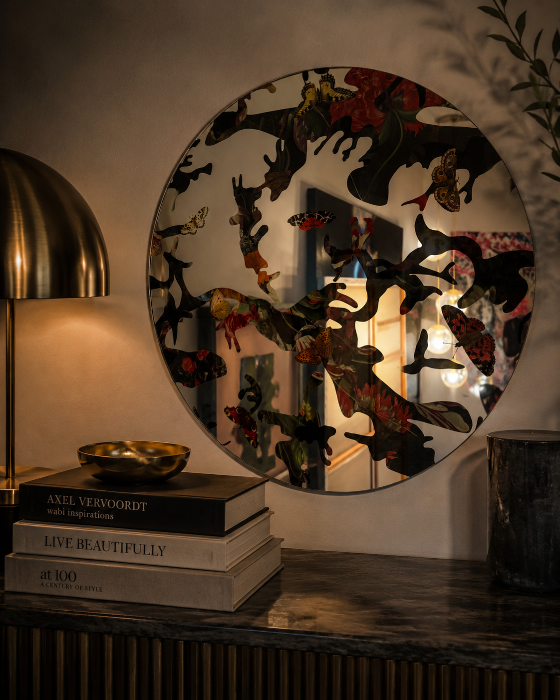
Magnus Gjoen
2023
Limited Edition of 25
Ø 70 cm
Reverse-printed sterling silver glass mirror
Made in Italy
Signed and numbered on verso
From The Allun Lewis Collection
THE STORY BEHIND THE PIECE
Sometimes the artwork isn't simply something you look at.
Sometimes you're actually part of it.
That's what makes Hide in Plain Sight so different from almost every other Magnus Gjoen piece within my collection.
It isn't a conventional artwork hanging behind glass.
It's a mirror.
And the moment you stand in front of it, you enter the artwork yourself.
HIDING IN PLAIN SIGHT
Across the surface, Magnus combines dark, almost camouflage-like forms with fragments of classical floral imagery and beautifully detailed butterflies.
Some elements immediately reveal themselves.
Others disappear into the pattern.
And then, underneath everything, is your own reflection.
The title suddenly starts to make complete sense.
Hide in Plain Sight.
Because nothing here is actually hidden.
It's all directly in front of you.
You simply have to notice it.
THE BUTTERFLIES
The butterflies are what initially bring the piece to life for me.
Against the darker forms surrounding them, they feel delicate and temporary — flashes of colour and beauty sitting on top of something considerably heavier.
There is transformation in them too.
A butterfly begins life as something completely different before eventually emerging into the form we recognise.
And whether Magnus intended that particular interpretation or not, it's one I enjoy.
Because we do something remarkably similar throughout our own lives.
We change.
We adapt.
We become different versions of ourselves.
Yet when we look in the mirror, somehow we're still looking for the same person.
WHEN THE VIEWER BECOMES THE ARTWORK
This is where I think the piece becomes particularly interesting.
With a painting or print, there is usually a very clear distinction.
The artwork is there.
You are here.
With Hide in Plain Sight, that separation disappears.
Stand in front of it and your face, your clothes, the room behind you and everything surrounding you becomes temporarily incorporated into Magnus's composition.
Move away and the image changes again.
The artwork is never entirely static because the reflection is never entirely the same.
Different room.
Different light.
Different person.
Different moment.
Same artwork.
BEAUTY, CAMOUFLAGE AND PERCEPTION
There's another reason this feels completely at home within my Magnus collection.
So much of his work plays with the difference between what something appears to be and what it actually is.
Grenades become beautiful decorative objects.
Mortality is covered with flowers.
Classical imagery collides with contemporary culture.
Here, that idea becomes almost literal.
Patterns conceal other patterns.
Butterflies appear amongst darkness.
Your reflection disappears into the artwork.
You can be completely visible and somehow still hidden.
AN EDITION OF 25
The mirror was produced in a particularly small edition of just 25.
Each example measures 70 cm in diameter, is made from reverse-printed sterling silver glass and was produced in Italy. Magnus signs and numbers each work on the reverse.
Its scale is important too.
At 70 cm, this isn't a small decorative object.
It has genuine presence on the wall.
And unlike almost everything else in the collection, it doesn't require a frame.
The artwork is the object.
WHY IT BELONGS IN MY COLLECTION
When I started collecting Magnus, I was drawn towards the contrast within his imagery.
But as the collection has developed, I've increasingly enjoyed the pieces where he takes that idea beyond a conventional print.
Hide in Plain Sight does exactly that.
It's art.
It's design.
It's a mirror.
It's something you can walk past every day and see differently depending upon the light, the room — or perhaps simply how you're feeling at that particular moment.
And it connects beautifully with the philosophy behind my collection.
Life Through Another Person's Lens.
Except with this piece, something slightly unusual happens.
Magnus gives you his lens.
And then places your own reflection directly inside it.
Perhaps that's the cleverest part of Hide in Plain Sight.
You begin by looking at the artwork.
And eventually realise the artwork is looking straight back at you.
From The Allun Lewis Collection
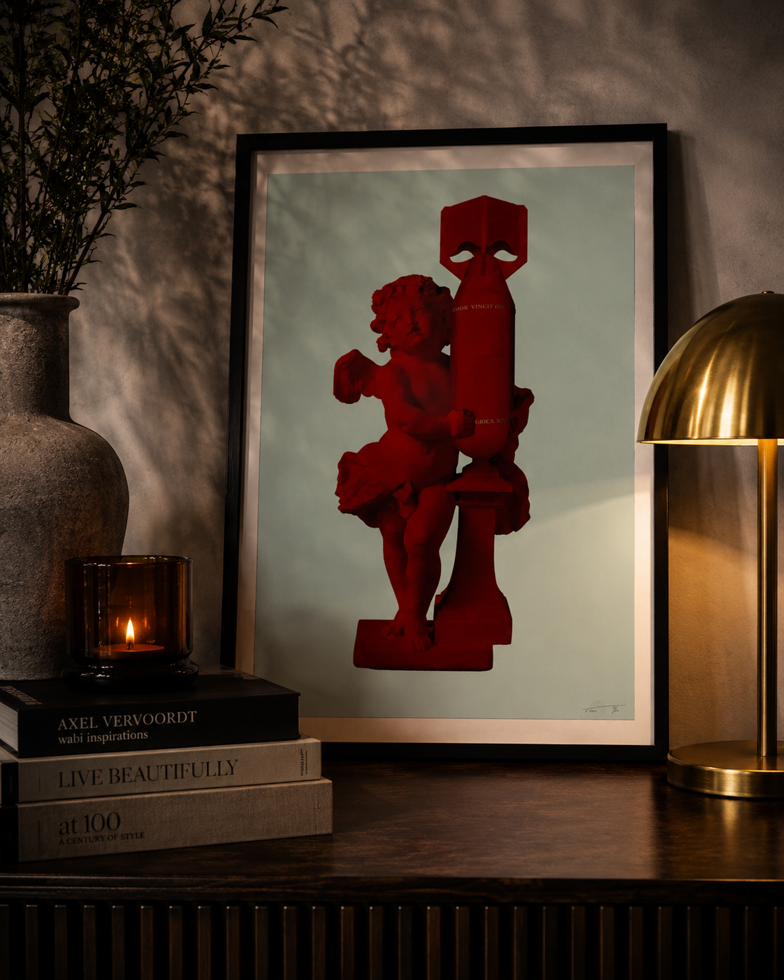
Magnus Gjoen
2020
Limited Edition of 50
50 × 72.5 cm
Archival pigment inks on 308gsm cotton rag
Signed and numbered by the artist
From The Allun Lewis Collection
THE STORY BEHIND THE PIECE
Same image. Same words. Yet somehow, an entirely different emotion.
This is another of the Cupid — Amor Vincit Omnia works within my Magnus Gjoen collection.
The composition is familiar.
Cupid — the classical symbol of love and desire — embraces an object created for precisely the opposite purpose.
A bomb.
Across it appear the words that first attracted me to this series:
AMOR VINCIT OMNIA
Love Conquers All.
But in this version, everything is red.
And for me, that changes the work completely.
THE COLOUR OF LOVE
Red is perhaps the colour we associate with love more than any other.
Red roses.
Red hearts.
Passion.
Desire.
Romance.
But red carries another vocabulary too.
Blood.
Danger.
Warning.
Violence.
And suddenly the choice of colour feels perfectly suited to the contradiction at the heart of the artwork.
The same colour can represent both love and destruction.
Perhaps that's why this version feels particularly powerful to me.
CUPID AND THE BOMB
There's something wonderfully unsettling about the way Cupid interacts with the weapon.
He doesn't appear frightened of it.
He isn't trying to escape from it.
He's embracing it.
That single gesture opens the work up to all sorts of interpretations.
Is love confronting destruction?
Is Cupid somehow neutralising the weapon?
Is Magnus suggesting that love itself can be dangerous?
Or is the image simply asking whether something as ancient and fundamental as love can survive our seemingly endless ability to destroy one another?
I don't know.
And I don't particularly want Magnus to give me the answer.
Because one of the things I've increasingly come to appreciate about his work is that the questions are often more interesting than the answers.
AMOR VINCIT OMNIA
The Latin words running across the image have survived in one form or another for more than two thousand years.
Amor Vincit Omnia.
Love Conquers All.
It's an extraordinarily optimistic idea when you think about it.
Wars have been fought.
Empires have risen and disappeared.
Entire civilisations have changed beyond recognition.
Yet generation after generation has continued to believe in essentially the same thing.
That somehow love matters.
That somehow it survives.
That somehow, despite everything humanity throws at itself, love remains stronger.
SAME ARTWORK. DIFFERENT LENS.
Owning different colourways of the same image has made me appreciate something I hadn't necessarily considered when I first began collecting art.
Colour doesn't simply change how an artwork looks.
It changes how an artwork feels.
The green version has an almost sculptural quality to me — as though Cupid and the bomb could be some strange classical monument.
The red version feels altogether more immediate.
More passionate.
More dangerous.
The image hasn't changed.
My response to it has.
And that fits perfectly with the philosophy behind my collection:
The freedom to see through somebody else's eyes without surrendering our own.
AN EDITION OF 50
This red version of Cupid (Amor Vincit Omnia) was created in 2020 as part of a limited edition of 50.
Measuring 50 × 72.5 cm, it was produced using archival pigment inks on 308gsm cotton rag and is signed and numbered by Magnus.
And there's another detail about my particular example that I love.
From the photograph of the signature, this appears to be 11/50.
That individual number gives this particular copy its own place within the edition.
WHY IT BELONGS IN MY COLLECTION
There are artworks that I collect because I love the image.
Others because I love the idea.
This one gives me both.
A classical symbol of love embraces a modern symbol of destruction.
The colour red manages to represent both.
And running quietly between them are four words that have travelled through centuries:
Amor Vincit Omnia.
Perhaps that's the ultimate contradiction within this artwork.
Human beings have become extraordinarily good at creating things capable of destroying one another.
Yet we remain equally determined to believe in love.
I know which of those ideas I want to win.
Amor Vincit Omnia.
Love Conquers All.
From The Allun Lewis Collection
Magnus Gjoen
2019
50 × 50 cm
Signed and numbered Artist Proof
Archival pigment inks and silk-screen varnish on 308gsm cotton rag
From The Allun Lewis Collection
THE STORY BEHIND THE PIECE
Sometimes beauty becomes more interesting when you discover what is hiding underneath it.
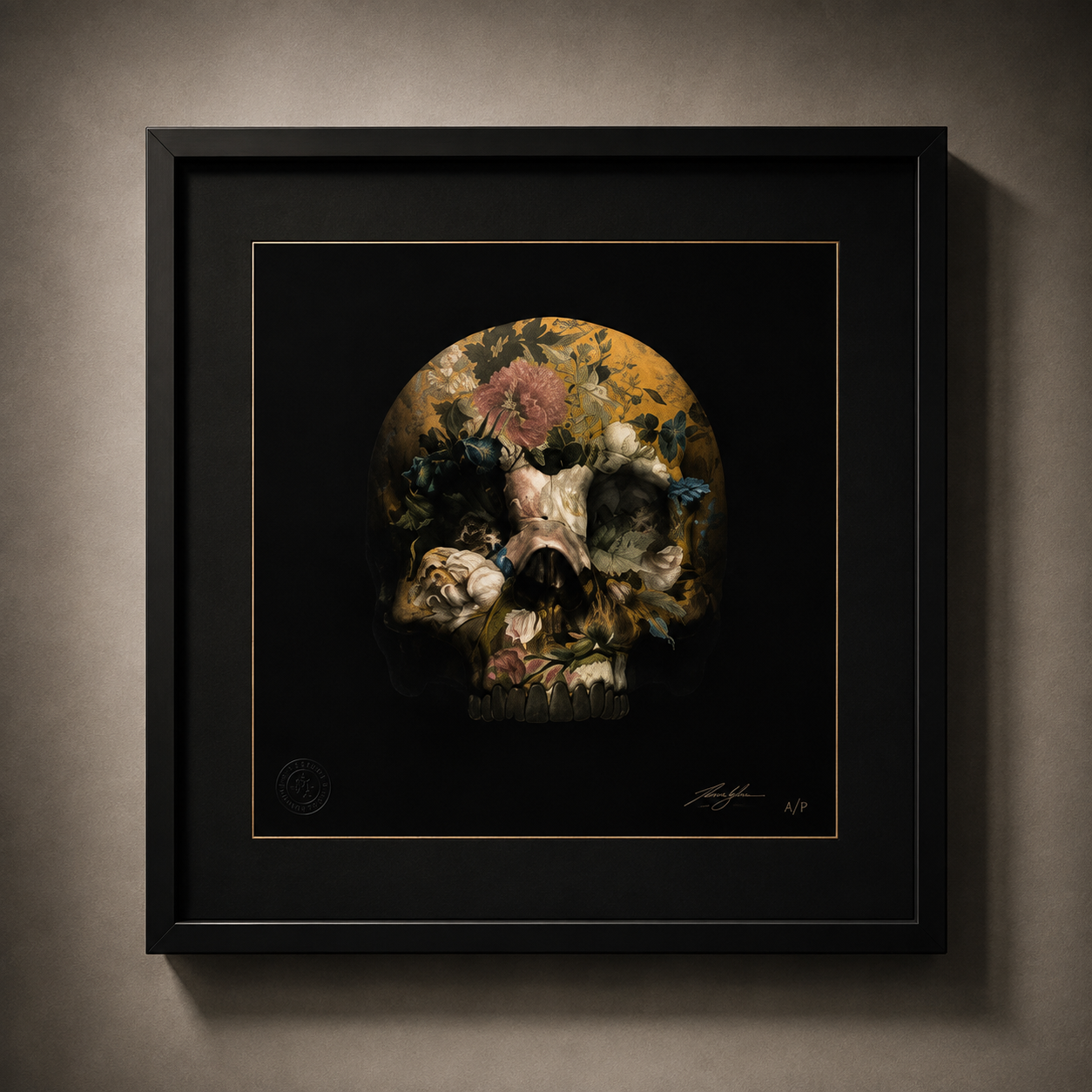
At first glance, There Is Strong Shadow Where There Is Much Light (Yellow) is extraordinarily decorative.
The yellows and golds immediately draw your eye. Flowers emerge from the darkness, intricate patterns appear across the surface and, sitting beneath all of that beauty, is the unmistakable form of a human skull.
But once you understand where Magnus drew some of his inspiration from, the piece becomes considerably darker.
BEAUTIFUL. BUT TERRIFYING.
Magnus connects these works to the opium dens that appeared in Victorian East London during the nineteenth century.
It's a fascinating reference.
He brings together Victorian-style florals and Chinoiserie-inspired colours with the skull, imagining something that could almost have appeared through the altered perception of somebody smoking opium.
Magnus describes the result perfectly:
“Beautiful but at the same time terrifying.”
And once you know that, it's difficult to look at the artwork in quite the same way again.
What initially appears decorative begins to feel hallucinatory.
The flowers aren't simply sitting on the skull.
They almost seem to be growing through it.
Reality and imagination start merging together.
THE YELLOW
For me, the yellow colourway makes that contradiction particularly interesting.
Yellow should feel optimistic.
Sunlight. Warmth. Energy. Life.
Yet here it surrounds one of art's oldest symbols of mortality.
That creates a strange visual contradiction.
The colour tells you life.
The skull tells you death.
And somehow Magnus allows both ideas to occupy exactly the same space.
It's one of the reasons I enjoy having different interpretations of related works within the collection.
Change the colour and you haven't necessarily changed the subject.
But you can completely change the way the subject feels.
THERE IS STRONG SHADOW WHERE THERE IS MUCH LIGHT
Then there is that extraordinary title.
There Is Strong Shadow Where There Is Much Light.
For me, those words are almost as important as the image.
Because light and darkness aren't always separate things.
Sometimes one allows us to understand the other.
The brightest periods of our lives can exist alongside extraordinarily difficult ones. Beauty can emerge from uncomfortable places. Something can appear wonderful while carrying a much darker story beneath its surface.
And perhaps that is what I take from this piece.
The presence of darkness doesn't necessarily extinguish the light.
Sometimes it makes us notice it.
LOOK AGAIN
That's something Magnus's work repeatedly makes me do.
Look once.
Then look again.
From across the room, this is a beautiful decorative skull.
Move closer and you begin discovering flowers, patterns, colours and tiny fragments of imagery.
Understand the historical references and another layer appears again.
Suddenly you're thinking about Victorian London, opium, altered perception, mortality and the strange relationship human beings have always had with escapism.
The artwork hasn't changed.
Only your understanding of it has.
And I think that's fascinating.
WHY IT BELONGS IN MY COLLECTION
This is exactly the kind of work that represents why I collect Magnus.
There is immediate visual beauty, but beauty is only the invitation.
Behind it sits history.
Symbolism.
Mortality.
Culture.
And just enough darkness to make you question what you're actually looking at.
I don't need an artwork to give me an answer.
I'd much rather it gave me another question.
LIFE THROUGH ANOTHER PERSON'S LENS
Perhaps that's also why this piece fits so naturally with the philosophy behind my wider collection.
Magnus has taken historical references, classical symbolism and his own imagination and given us his interpretation of them.
I can understand what he saw.
But I'm still free to see something different.
Someone else standing in front of the same piece may see something different again.
The freedom to see through somebody else's eyes without surrendering our own.
And perhaps that's the real beauty of this particular work.
At first, you see the light.
Then you notice the shadow.
And eventually you realise that one may never have been quite as powerful without the other.
From The Allun Lewis Collection
Magnus Gjoen
2022
Edition 61 of 150
25 × 17.5 cm
Archival ink on 300gsm cotton rag
Signed and numbered by the artist
From The Allun Lewis Collection
THE STORY BEHIND THE PIECE
Love is usually represented by hearts, flowers and romance.
Magnus gives us something rather different.
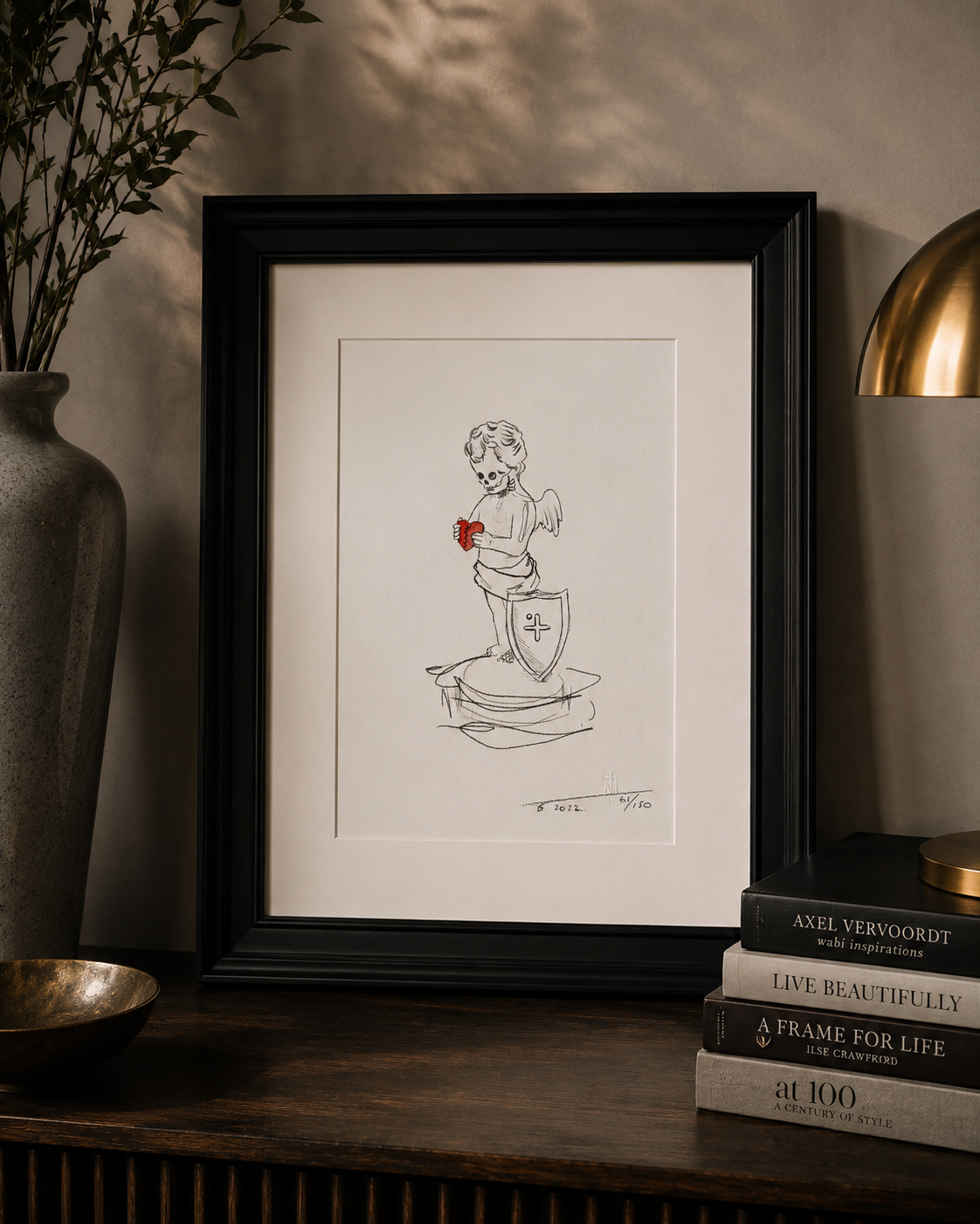
At first glance, Anatomy of Cupid is almost playful.
A tiny winged cherub stands alone against an expanse of white paper. In his hands is the one burst of colour within the entire composition — a vivid red heart.
But then you look at his face.
Cupid is a skeleton.
And suddenly this seemingly innocent little image begins to say considerably more.
LOVE AND MORTALITY
Cupid has represented love and desire for centuries.
We normally encounter him as an innocent, youthful figure armed with a bow and arrow, capable of making people fall helplessly in love.
Here, Magnus strips that familiar character back to the one thing none of us can escape.
Mortality.
Yet Cupid is still holding the heart.
That's the detail I find most interesting.
The body has changed. The innocence has disappeared. Mortality is staring directly back at us.
But the heart remains.
For me, there's something surprisingly optimistic about that.
SOMETHING WORTH PROTECTING
Beside Cupid sits a shield.
That changes the way I see the piece again.
Perhaps the heart isn't simply something Cupid possesses.
Perhaps it's something he's protecting.
And there's an idea within that which I particularly like.
We spend so much of our lives protecting ourselves from being hurt. Experience makes us more cautious. Relationships leave their marks. Time changes us.
Yet completely protecting ourselves would require us never to risk loving anything in the first place.
And what sort of life would that be?
The things capable of hurting us most are often the things that matter to us most.
Love makes us vulnerable.
Perhaps that's precisely why it's worth protecting.
61 OF 150
My example is number 61 from the edition of 150, signed and numbered by Magnus.
It's a relatively small work, and I think that actually suits it.
There is no huge explosion of colour or elaborate composition competing for your attention.
Just Cupid.
A heart.
A shield.
And an enormous amount of empty space.
Everything that matters has been reduced to a handful of symbols.
WHY IT BELONGS IN MY COLLECTION
The more Magnus works I've collected, the more I've realised that the pieces don't necessarily need to be large or visually complicated to make me think.
Sometimes the simplest images raise the biggest questions.
Is Cupid protecting the heart?
Is the heart all that remains?
Does love survive mortality?
Or is Magnus simply reminding us that even Cupid eventually meets the same fate as everybody else?
I don't think I need to know the answer.
In fact, I'd rather not.
Because that's part of what I enjoy about art.
The artist can give us the symbols.
We decide what they mean.
And every time I look at this little Cupid clutching his red heart, I find myself coming back to the same thought:
If something is worth loving, perhaps it's worth being vulnerable for.
From The Allun Lewis Collection
Magnus Gjoen
2023
Edition 49 of 100
20 × 20 cm
Archival pigment inks on cotton rag
Signed, dated and numbered by the artist
From The Allun Lewis Collection
THE STORY BEHIND THE PIECE
Same image. Different colour. Completely different presence.
This is the second Vive Le Roi within my collection.
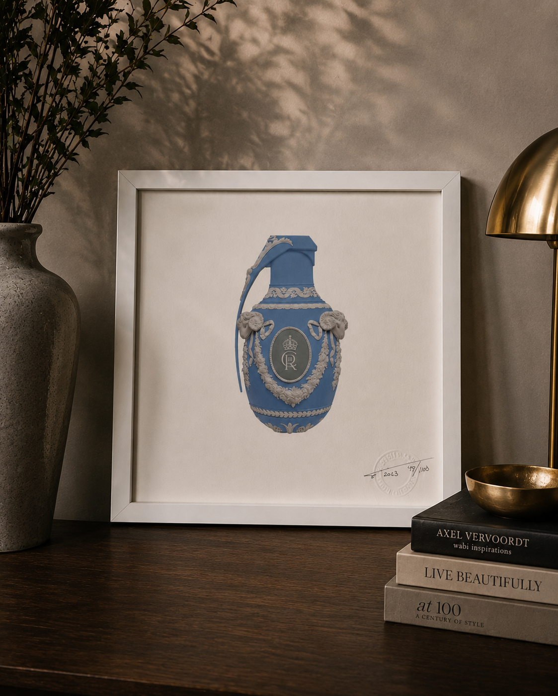
At its centre is the same extraordinary contradiction: an object decorated with the visual language of classical luxury, royalty and ceremony which, once you recognise its silhouette, reveals itself to be something altogether more threatening.
A grenade.
But where the pink edition feels almost playful in its contradiction, I've always felt something different from the blue.
It feels cooler.
More formal.
Perhaps even more regal.
And that's one of the reasons I wanted both.
THE SAME — BUT DIFFERENT
I find colour fascinating in art because it can completely change our response to an image without changing the image itself.
The ornate decoration remains.
The royal insignia remains.
The grenade remains.
Yet change the colour and somehow the personality of the work changes with it.
The soft blue against the white decorative detailing gives this version an almost porcelain-like quality.
From a distance, it could be a beautiful decorative object.
Something historic.
Something precious.
Something that deserves to be protected.
Move closer and the illusion disappears.
Beauty becomes danger.
And that's where the work becomes unmistakably Magnus.
LONG LIVE THE KING
Vive Le Roi translates as:
Long Live the King.
Created in 2023, the year of the Coronation of King Charles III, the imagery inevitably brings monarchy, succession, ceremony and power to mind.
But what I particularly like is that Magnus doesn't give us a portrait of a King.
Instead, he gives us a symbol.
The crown and royal insignia sit upon an object associated not with ceremony, but destruction.
For me, that creates an interesting tension.
Throughout history, power has almost always been surrounded by extraordinary beauty — palaces, paintings, uniforms, jewellery, ceremony and tradition.
But history also reminds us that power and conflict have rarely existed very far apart.
Here, those two worlds occupy exactly the same object.
Beauty on the surface.
Danger underneath.
TWO VERSIONS. TWO RESPONSES.
Owning both the pink and blue versions makes these particularly interesting to me as a pair.
Put them alongside one another and logically they should feel almost identical.
They don't.
The pink feels softer and perhaps slightly more subversive because of it.
The blue feels more traditional, restrained and authoritative.
Yet underneath both colours is exactly the same grenade.
And perhaps there's another interpretation in that.
We naturally judge things by their appearance.
Colour changes our expectations.
Decoration changes our expectations.
Presentation changes our expectations.
But none of those things necessarily change what something fundamentally is.
49 OF 100
My blue example is number 49 from the edition of 100, signed, dated and numbered by Magnus.
At just 20 × 20 cm, it's a relatively small work.
But displayed alongside its pink counterpart, the two become something more interesting than either work in isolation.
They allow you to see exactly how dramatically colour can alter perception.
WHY THEY BELONG TOGETHER
I could quite easily have chosen one.
Instead, I wanted both.
Not simply because they're two different colourways, but because together they illustrate something I increasingly recognise within my collection.
The way something makes us feel isn't determined solely by what we're looking at.
It's determined by how we see it.
Two people can stand in front of exactly the same artwork and see completely different things.
Change something as seemingly simple as the colour and even our own interpretation can change.
And that brings me straight back to the philosophy behind this entire collection:
The freedom to see through somebody else's eyes without surrendering our own.
Same grenade.
Same symbolism.
Same artist.
Different lens.
Vive Le Roi.
Long live the King.
From The Allun Lewis Collection
Magnus Gjoen
2020
Edition 35 of 50
50 × 72.5 cm
Archival pigment inks on 308gsm cotton rag
Signed and numbered by the artist
From The Allun Lewis Collection
THE STORY BEHIND THE PIECE
The image hasn't changed.
But the way I see it has.
This is another of the Cupid — Amor Vincit Omnia works within my Magnus Gjoen collection.
The composition is exactly the same.
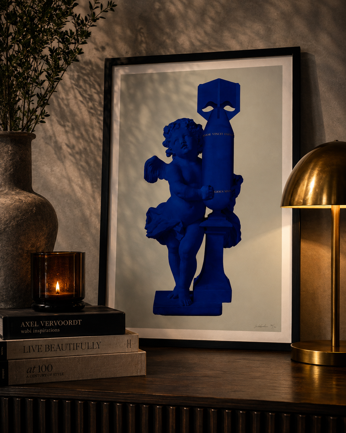
Cupid, one of the most enduring symbols of love, embraces an object created for destruction.
A bomb.
And running quietly across it are the words that originally drew me towards this series:
AMOR VINCIT OMNIA
Love Conquers All.
Yet in this version, everything is rendered in this extraordinary deep blue.
And somehow that changes the entire mood of the work.
THE COLOUR BLUE
Where the red version feels immediate, passionate and perhaps even dangerous, the blue feels calmer.
More considered.
Almost peaceful.
Blue is a colour we associate with completely different emotions.
The sky.
The sea.
Calmness.
Trust.
Stability.
Peace.
And that creates another wonderful contradiction.
Because the object Cupid is embracing represents none of those things.
It's a weapon.
Something created for destruction has been presented in a colour we instinctively associate with calm.
And the longer I look at it, the more interesting that contradiction becomes.
LOVE AND DESTRUCTION
Cupid doesn't appear frightened.
He isn't turning away from the bomb.
He isn't trying to destroy it.
He's holding it.
There's something strangely tender about the gesture.
And perhaps that's what makes the image so powerful.
Magnus takes two symbols from completely different worlds and forces them together.
One represents our capacity to love.
The other represents our capacity to destroy.
And between them sit four words:
Amor Vincit Omnia.
Perhaps Cupid is protecting us from the weapon.
Perhaps love is somehow neutralising it.
Perhaps the work is questioning whether love really can overcome humanity's capacity for violence.
Or perhaps it means something completely different.
That's for the person standing in front of it to decide.
SAME IMAGE. DIFFERENT EMOTION.
Owning several colourways of this work has given me an interesting opportunity.
Normally, when we look at two different artworks, everything changes — the composition, imagery, colours and subject.
Here, almost nothing changes.
Except the colour.
And yet my emotional response to each version is completely different.
The red feels passionate and dangerous.
The green has an almost classical, sculptural quality.
And this blue version feels calmer and more reflective.
Same Cupid.
Same bomb.
Same words.
Different lens.
And I find that fascinating.
35 OF 50
My example is number 35 from the edition of 50, signed and numbered by Magnus.
Created in 2020, the work measures 50 × 72.5 cm and was produced using archival pigment inks on 308gsm cotton rag.
I enjoy recording the edition numbers within the collection because while every example carries the same image, each numbered work has its own individual place within the edition.
This one is:
35 / 50
And it now has its own place within the wider story of my Magnus collection.
AMOR VINCIT OMNIA
What ultimately connects all of these Cupid works for me isn't the colour.
It's those words.
Love Conquers All.
The idea is ancient.
The image is contemporary.
And the question sitting between them is timeless.
Can love really overcome everything?
History might give us plenty of reasons to doubt it.
But humanity has spent thousands of years continuing to believe that it can.
And maybe that's what I take from this particular blue version.
Against something created to destroy, Cupid isn't fighting.
He isn't running.
He's simply holding on.
WHY IT BELONGS IN MY COLLECTION
The more these different versions sit alongside one another, the more I appreciate them as a group rather than simply as individual prints.
Together, they demonstrate something I believe very strongly about art.
What we see is only part of what determines what we feel.
Change the colour and our interpretation changes.
Change the person standing in front of it and it changes again.
Which brings me back, once more, to the philosophy behind the collection:
The freedom to see through somebody else's eyes without surrendering our own.
Magnus gives us Cupid.
He gives us the bomb.
He gives us four words.
Everything after that belongs to us.
Amor Vincit Omnia.
Love Conquers All.
From The Allun Lewis Collection
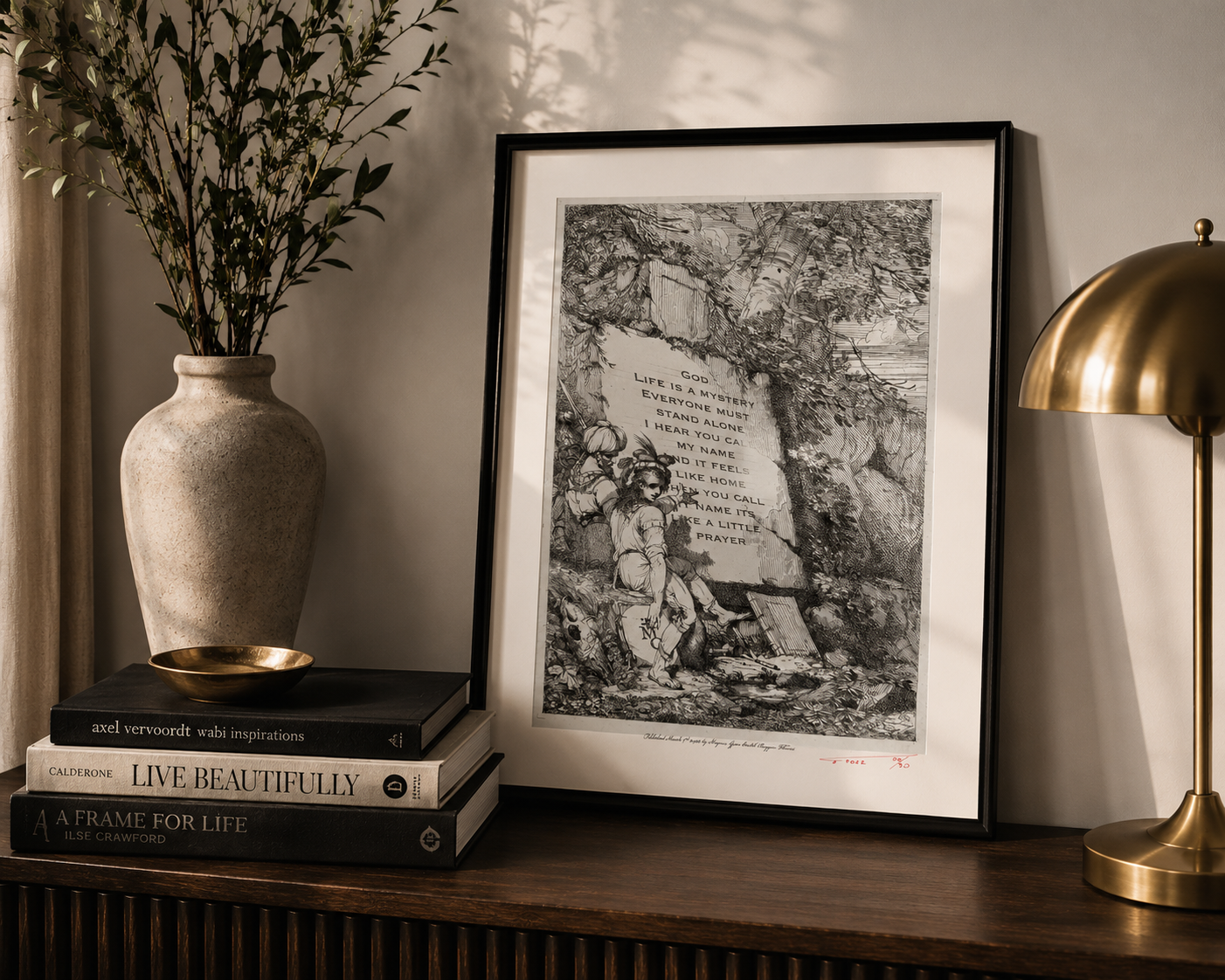
Magnus Gjoen
2022
Edition 20 of 30
36 × 26 cm
Archival inks on embossed 310gsm cotton rag
Signed and numbered by the artist
From The Allun Lewis Collection
THE STORY BEHIND THE PIECE
Sometimes contemporary art doesn't need to shout.
At first glance, Like A Prayer feels as though it could have been lifted from another century.
The monochrome landscape, the extraordinary detail and the children gathered beside the stone give the work the appearance of an old engraving or forgotten historical illustration.
And then you begin to read the words.
“Life is a mystery
Everyone must stand alone
I hear you call my name
And it feels like home…”
Suddenly, the piece becomes something completely different.
Words many of us immediately associate with Madonna's Like a Prayer have been transported from popular culture and placed into an image that appears to belong to another time entirely.
And I love that contradiction.
OLD AND NEW
It's something I find myself continually drawn towards in Magnus's work.
He takes imagery that feels historic, classical or almost sacred and introduces something completely contemporary.
The two shouldn't necessarily belong together.
Yet somehow they do.
Removed from the music and placed within this setting, the words begin to take on another meaning.
Life is a mystery.
Everyone must stand alone.
I hear you call my name.
Read as an inscription rather than heard as lyrics, something familiar suddenly feels philosophical — perhaps even spiritual.
And that's what makes this piece particularly clever to me.
It's immediately recognisable once you understand what you're looking at, but until that moment it could quite easily pass as something created centuries ago.
A SMALL EDITION
My example is number 20 from an edition of just 30, signed and numbered by Magnus.
I don't collect art because of an edition number, but I do enjoy these details. They give each individual work its own place within the wider story of an edition.
This one happens to be:
20 / 30
One of only thirty.
WHY IT BELONGS IN MY COLLECTION
The more my collection has developed, the more I've realised that I'm drawn to artwork that makes you look once — and then makes you look again.
Like A Prayer does exactly that.
From across the room, you could believe you're looking at an antique engraving.
Move closer and everything changes.
Contemporary popular culture has been hidden inside something that appears centuries old.
But underneath that clever juxtaposition is something else I particularly like.
Meaning changes depending on who's standing in front of the artwork.
One person might see Madonna.
Another might see religion.
Someone else might see loneliness, love, faith or simply a beautifully constructed image.
And perhaps that's why this little piece fits so naturally within my collection.
Because it comes back to the philosophy behind the collection itself:
The freedom to see through somebody else's eyes without surrendering our own.
Magnus gives us the image.
What we see within it is ultimately ours.
From The Allun Lewis Collection
THE COLLECTION CONTINUES
My collection of Magnus Gjoen’s work has grown over a number of years — through pieces discovered, works acquired directly from Magnus, and others whose stories have gradually become intertwined with my own.
It isn’t intended to be a complete representation of his work. It is simply a collection of the pieces that made me stop, look and feel something.
Beauty and destruction. Love and mortality. History and modernity.
Different works. Different stories. One extraordinary lens.
PRIVATE ENQUIRIES
The works shown form part of my privately held collection.
While they were acquired primarily because I wanted to live with them, enquiries regarding the potential availability of individual pieces are welcomed.
THE ALLUN LEWIS COLLECTION
Life Through Another Person’s Lens