

 Image 1 of 1
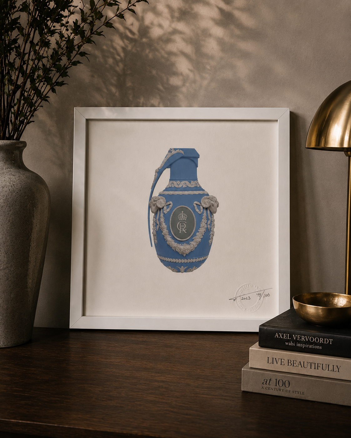
VIVE LE ROI — BLUE
Magnus Gjoen
2023
Edition 49 of 100
20 × 20 cm
Archival pigment inks on cotton rag
Signed, dated and numbered by the artist
From The Allun Lewis Collection
THE STORY BEHIND THE PIECE
Same image. Different colour. Completely different presence.
This is the second Vive Le Roi within my collection.
At its centre is the same extraordinary contradiction: an object decorated with the visual language of classical luxury, royalty and ceremony which, once you recognise its silhouette, reveals itself to be something altogether more threatening.
A grenade.
But where the pink edition feels almost playful in its contradiction, I've always felt something different from the blue.
It feels cooler.
More formal.
Perhaps even more regal.
And that's one of the reasons I wanted both.
THE SAME — BUT DIFFERENT
I find colour fascinating in art because it can completely change our response to an image without changing the image itself.
The ornate decoration remains.
The royal insignia remains.
The grenade remains.
Yet change the colour and somehow the personality of the work changes with it.
The soft blue against the white decorative detailing gives this version an almost porcelain-like quality.
From a distance, it could be a beautiful decorative object.
Something historic.
Something precious.
Something that deserves to be protected.
Move closer and the illusion disappears.
Beauty becomes danger.
And that's where the work becomes unmistakably Magnus.
LONG LIVE THE KING
Vive Le Roi translates as:
Long Live the King.
Created in 2023, the year of the Coronation of King Charles III, the imagery inevitably brings monarchy, succession, ceremony and power to mind.
But what I particularly like is that Magnus doesn't give us a portrait of a King.
Instead, he gives us a symbol.
The crown and royal insignia sit upon an object associated not with ceremony, but destruction.
For me, that creates an interesting tension.
Throughout history, power has almost always been surrounded by extraordinary beauty — palaces, paintings, uniforms, jewellery, ceremony and tradition.
But history also reminds us that power and conflict have rarely existed very far apart.
Here, those two worlds occupy exactly the same object.
Beauty on the surface.
Danger underneath.
TWO VERSIONS. TWO RESPONSES.
Owning both the pink and blue versions makes these particularly interesting to me as a pair.
Put them alongside one another and logically they should feel almost identical.
They don't.
The pink feels softer and perhaps slightly more subversive because of it.
The blue feels more traditional, restrained and authoritative.
Yet underneath both colours is exactly the same grenade.
And perhaps there's another interpretation in that.
We naturally judge things by their appearance.
Colour changes our expectations.
Decoration changes our expectations.
Presentation changes our expectations.
But none of those things necessarily change what something fundamentally is.
49 OF 100
My blue example is number 49 from the edition of 100, signed, dated and numbered by Magnus.
At just 20 × 20 cm, it's a relatively small work.
But displayed alongside its pink counterpart, the two become something more interesting than either work in isolation.
They allow you to see exactly how dramatically colour can alter perception.
WHY THEY BELONG TOGETHER
I could quite easily have chosen one.
Instead, I wanted both.
Not simply because they're two different colourways, but because together they illustrate something I increasingly recognise within my collection.
The way something makes us feel isn't determined solely by what we're looking at.
It's determined by how we see it.
Two people can stand in front of exactly the same artwork and see completely different things.
Change something as seemingly simple as the colour and even our own interpretation can change.
And that brings me straight back to the philosophy behind this entire collection:
The freedom to see through somebody else's eyes without surrendering our own.
Same grenade.
Same symbolism.
Same artist.
Different lens.
Vive Le Roi.
Long live the King.
From The Allun Lewis Collection
Magnus Gjoen
2023
Edition 49 of 100
20 × 20 cm
Archival pigment inks on cotton rag
Signed, dated and numbered by the artist
From The Allun Lewis Collection
THE STORY BEHIND THE PIECE
Same image. Different colour. Completely different presence.
This is the second Vive Le Roi within my collection.
At its centre is the same extraordinary contradiction: an object decorated with the visual language of classical luxury, royalty and ceremony which, once you recognise its silhouette, reveals itself to be something altogether more threatening.
A grenade.
But where the pink edition feels almost playful in its contradiction, I've always felt something different from the blue.
It feels cooler.
More formal.
Perhaps even more regal.
And that's one of the reasons I wanted both.
THE SAME — BUT DIFFERENT
I find colour fascinating in art because it can completely change our response to an image without changing the image itself.
The ornate decoration remains.
The royal insignia remains.
The grenade remains.
Yet change the colour and somehow the personality of the work changes with it.
The soft blue against the white decorative detailing gives this version an almost porcelain-like quality.
From a distance, it could be a beautiful decorative object.
Something historic.
Something precious.
Something that deserves to be protected.
Move closer and the illusion disappears.
Beauty becomes danger.
And that's where the work becomes unmistakably Magnus.
LONG LIVE THE KING
Vive Le Roi translates as:
Long Live the King.
Created in 2023, the year of the Coronation of King Charles III, the imagery inevitably brings monarchy, succession, ceremony and power to mind.
But what I particularly like is that Magnus doesn't give us a portrait of a King.
Instead, he gives us a symbol.
The crown and royal insignia sit upon an object associated not with ceremony, but destruction.
For me, that creates an interesting tension.
Throughout history, power has almost always been surrounded by extraordinary beauty — palaces, paintings, uniforms, jewellery, ceremony and tradition.
But history also reminds us that power and conflict have rarely existed very far apart.
Here, those two worlds occupy exactly the same object.
Beauty on the surface.
Danger underneath.
TWO VERSIONS. TWO RESPONSES.
Owning both the pink and blue versions makes these particularly interesting to me as a pair.
Put them alongside one another and logically they should feel almost identical.
They don't.
The pink feels softer and perhaps slightly more subversive because of it.
The blue feels more traditional, restrained and authoritative.
Yet underneath both colours is exactly the same grenade.
And perhaps there's another interpretation in that.
We naturally judge things by their appearance.
Colour changes our expectations.
Decoration changes our expectations.
Presentation changes our expectations.
But none of those things necessarily change what something fundamentally is.
49 OF 100
My blue example is number 49 from the edition of 100, signed, dated and numbered by Magnus.
At just 20 × 20 cm, it's a relatively small work.
But displayed alongside its pink counterpart, the two become something more interesting than either work in isolation.
They allow you to see exactly how dramatically colour can alter perception.
WHY THEY BELONG TOGETHER
I could quite easily have chosen one.
Instead, I wanted both.
Not simply because they're two different colourways, but because together they illustrate something I increasingly recognise within my collection.
The way something makes us feel isn't determined solely by what we're looking at.
It's determined by how we see it.
Two people can stand in front of exactly the same artwork and see completely different things.
Change something as seemingly simple as the colour and even our own interpretation can change.
And that brings me straight back to the philosophy behind this entire collection:
The freedom to see through somebody else's eyes without surrendering our own.
Same grenade.
Same symbolism.
Same artist.
Different lens.
Vive Le Roi.
Long live the King.
From The Allun Lewis Collection